Shopstar.pe

Shopstar.pe

Building a Figma Design System for an e-commerce

Building a Figma Design System for an e-commerce

E-Commerce • UI Design

E-Commerce • UI Design

Overview

Overview

Role

Role

  • UI Designer.

  • Met constantly with lead UX, project manager, developers and designers.

  • Duration: 7 months.

  • UI Designer.

  • Met constantly with lead UX, project manager, developers and designers.

  • Duration: 7 months.

About

About

Shopstar.pe is a Peruvian e-commerce website that allows Interbank customers to exchange their credit card points for products from various marketplaces and entrepreneurs. In this project, I created a design system in Figma for the UX/UI team, which was struggling to deliver consistent designs.

Shopstar.pe is a Peruvian e-commerce website that allows Interbank customers to exchange their credit card points for products from various marketplaces and entrepreneurs. In this project, I created a design system in Figma for the UX/UI team, which was struggling to deliver consistent designs.

Project Goal

Project Goal

Consistent UI: to reduce technical debt and create a solid brand identity.

Consistent UI: to reduce technical debt and create a solid brand identity.

Workflow efficiency: to optimize internal operations and save time.

Workflow efficiency: to optimize internal operations and save time.

Challenges

Challenges

Problems with existent design system worklow in Sketch

Problems with existent design system worklow in Sketch

Inconsistency

Inconsistency

MVP: UI Kit

Before building the system, I conducted a series of individual online interviews with each team member: one UX/UI designer, one lead designer, and two front-end developers. These interviews focused on identifying their needs and challenges with the current workflow. The main insight I gained was the following:

Before building the system, I conducted a series of individual online interviews with each team member: one UX/UI designer, one lead designer, and two front-end developers. These interviews focused on identifying their needs and challenges with the current workflow. The main insight I gained was the following:

Developers: "We have a hard time figuring out each component's behavior"

Designers: "It's difficult to coexist with Figma and Sketch at the same time"

The answer was clear: we needed to choose a single software to establish one source of truth for both designers and developers.

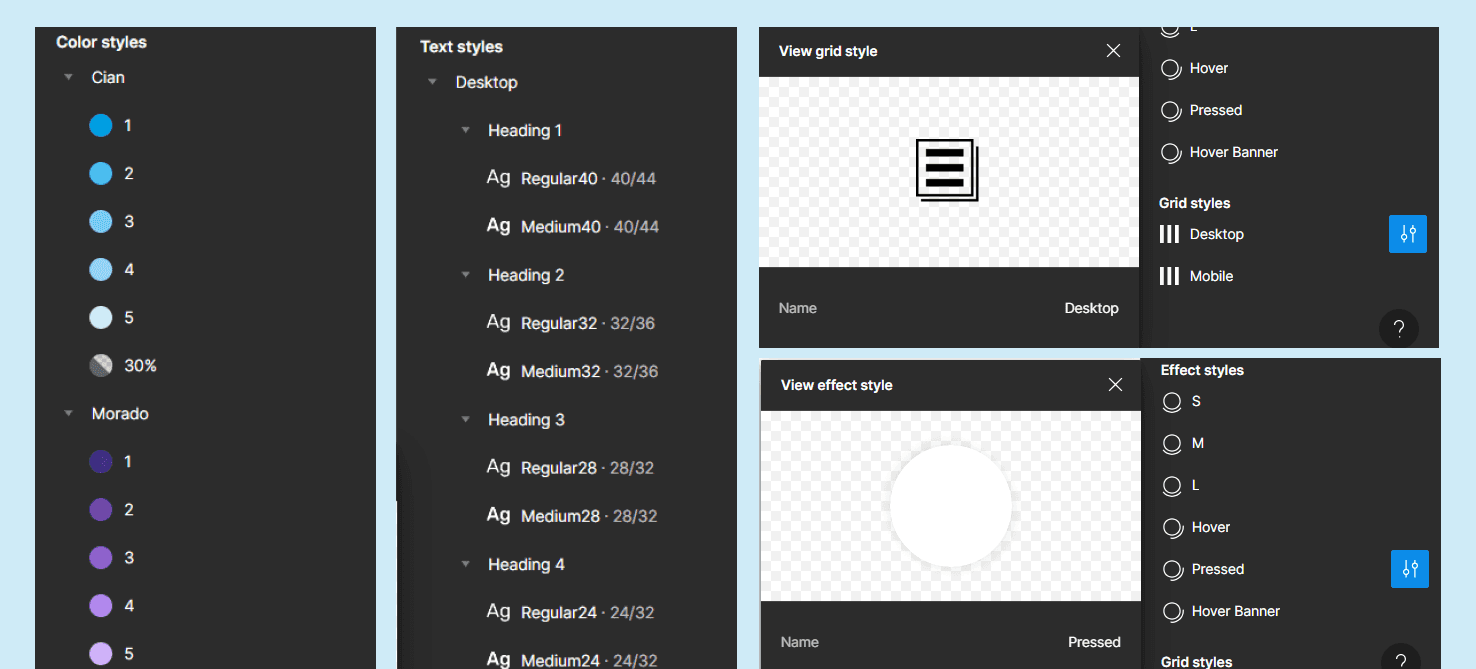
After careful consideration, the design team agreed to choose Figma over Sketch. I then gathered all recently delivered prototypes, analyzed their styles and components, and created a UI Kit in Figma that looked like this:

Designers simply needed to click on the style to automatically apply the library’s color, text, shadow, or grid to the element:

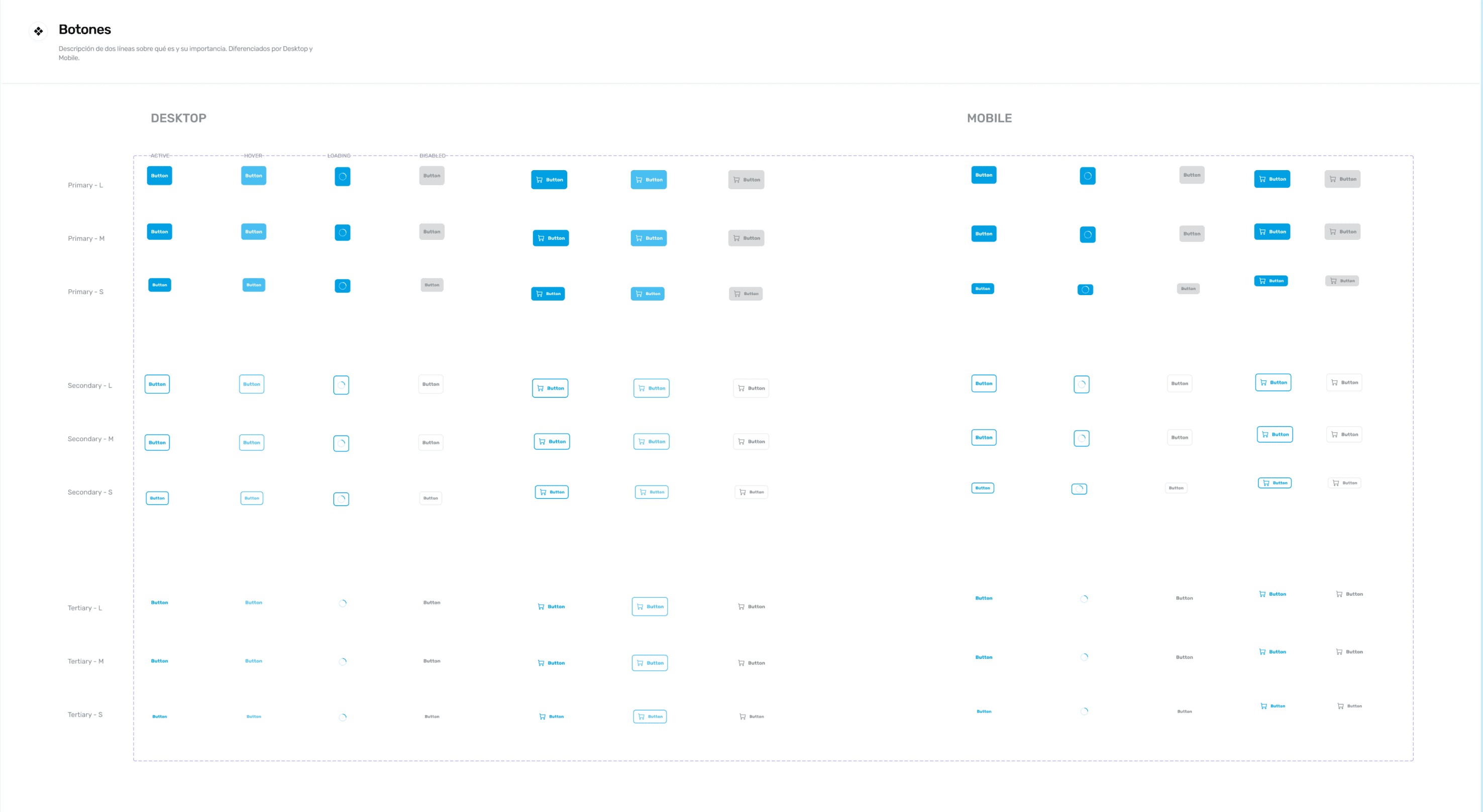
Similarly, for components like buttons, designers only needed to go to Assets, type 'button,' and click and drag the element. They could then choose from properties such as:

  • Device: Mobile, Desktop.

  • Hierarchy: Primary, Secondary, Tertiary.

  • Size: L56, L52, M48, S40, S32.

  • State: Active, Hover, Loading, Disabled.

  • Icon?: Yes, no.

  • Text: Change the text.

The end result after making all possible variables for each component looked like this:

I did the same process with inputs, dropdowns, search bars, notifications, tool tips, badge, loaders, radio buttons, checkbox, modals, tables, cards, and navbars.

For the icons, we created our own set, organized by size. Any time we needed to create a new icon, we followed a system to maintain consistency: 32 x 32 box, 2 pixels of thickness.

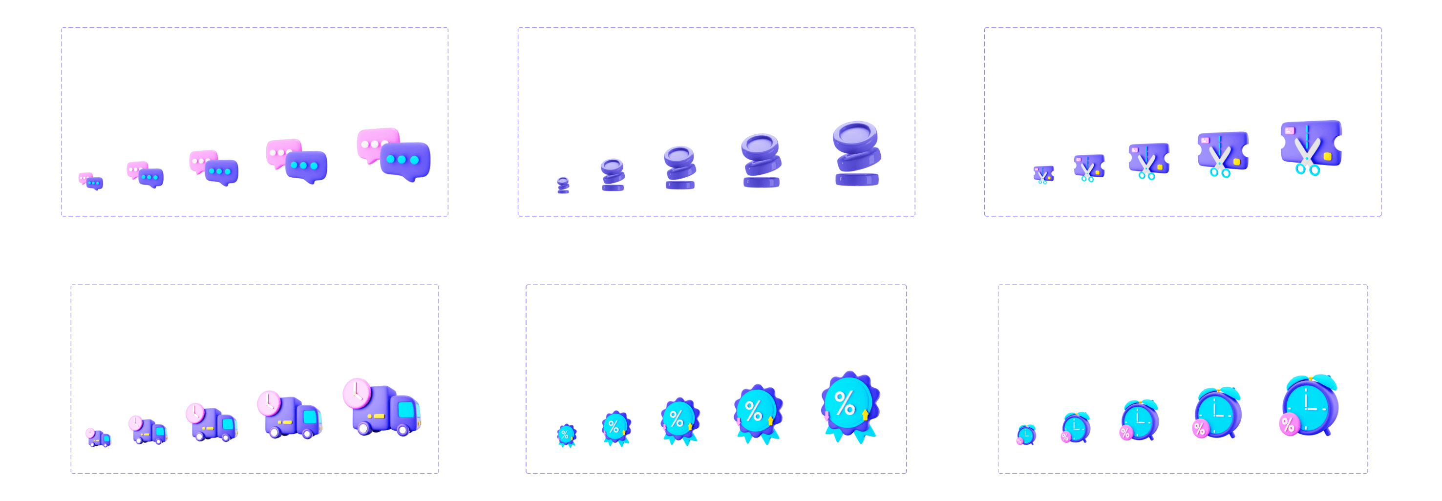
Illustrations were also organized by size:

After organizing and labeling all styles and components, I gathered the team to explain how to use the new UI Kit. Whenever we decided to upload a component, I was responsible for updating the kit, which would automatically reflect changes across all our Figma files. The final step was to create a Design System and start documenting the behavior of all elements.

La Playa Design System

La Playa Design System

La Playa Design System is is Shopstar's comprehensive guide. It includes principles, categorizations, best practices, and the entire visual identity of Shopstar. Each element has its own set of rules and classes that must remain consistent throughout the design and development process. For example, here are the documented principles for the shadow element in La Playa:

La Playa Design System is is Shopstar's comprehensive guide. It includes principles, categorizations, best practices, and the entire visual identity of Shopstar. Each element has its own set of rules and classes that must remain consistent throughout the design and development process. For example, here are the documented principles for the shadow element in La Playa:

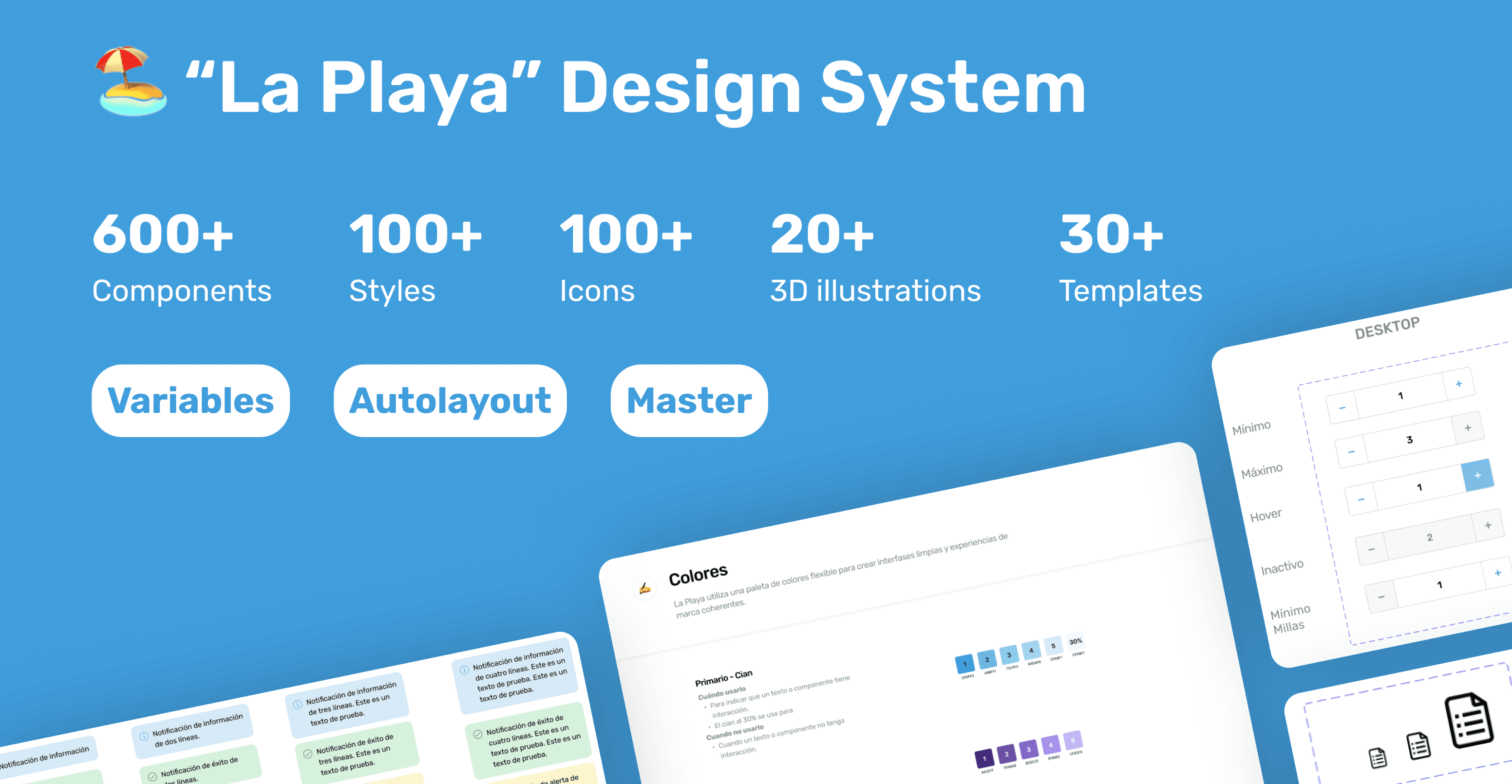
As a team, we followed the same process to document colors, fonts, spacing, grids, badges, buttons, breadcrumbs, and cards. The first version of La Playa now includes over 600 components, 100 styles, 100 icons, 20 3D illustrations, and 30 templates. All of these elements utilize variables and are built using Figma best practices, such as Autolayout and Master components.

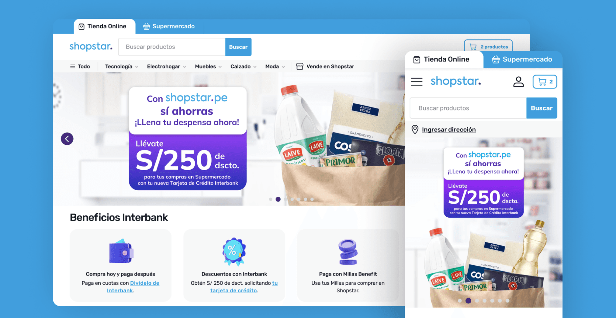
As well, with La Playa, the design team could create more consistent and aesthetically pleasing designs:

As well, with La Playa, the design team could create more consistent and aesthetically pleasing designs:

Looking to the future, it’s important to note that the system is constantly evolving and will continue to do so as long as the product and software are updated.


This process sparked numerous discussions within the team about enhancing involvement in the post-handoff process for the front-end team. It was a significant project, and the entire team was eager to see it come to fruition. This is certainly my proudest project so far, as I led its creation while still an intern at Shopstar, learning many things independently along the way.
Results

Results

100% satisfaction

(according to an internal evaluation at the end of the year)

100% satisfaction

(according to an internal evaluation at the end of the year)

75% increase in efficiency

(measuring the time designers took in creating a prototype before and after)

75% increase in efficiency

(measuring the time designers took in creating a prototype before and after)

Key Learnings

Key Learnings

One step at a time

As the sprint progressed, I realized this was a massive project involving significant changes in business management and a reworking of old and new design elements. Feeling overwhelmed, I followed my UX lead’s advice to divide the project into phases, which made the process much more manageable.

Aesthetics + Structure = UI design

UI designers must have a systemic and collaborative mindset. Before starting, they need to define and design multiple use cases for each element (buttons, notifications, forms, etc.), adhere to accessibility standards, understand the team’s habits, and explain how to use each component. This first project marked the beginning of a long-term relationship with this craft.

© Rosa Moriya 2023

Made with Framer

© Rosa Moriya 2023

Made with Framer