terabike
terabike
Creating identity and building a UI Kit for a Startup
Creating identity and building a UI Kit for a Startup
Android • UI Design
Android • UI Design


Overview
Overview
Role
Role
UI Designer.
Met constantly with UX Designer.
Duration: 3 months.
UI Designer.
Met constantly with UX Designer.
Duration: 3 months.
About
About
Tera Technologies is a Peruvian startup developing 'TeraBike,' a mobile app that connects passengers with motorcycle taxi drivers. In this project, I worked closely with the UX Designer to style the UI and create a UI Kit for the new app. After three months, I delivered a complete set of UI components and integrated them into the wireframes.
Tera Technologies is a Peruvian startup developing 'TeraBike,' a mobile app that connects passengers with motorcycle taxi drivers. In this project, I worked closely with the UX Designer to style the UI and create a UI Kit for the new app. After three months, I delivered a complete set of UI components and integrated them into the wireframes.
Project Goal
Project Goal
To create a consistent identity across multiple channels.
To create a consistent identity across multiple channels.
To design prototypes more efficiently.
To design prototypes more efficiently.
Challenges
Challenges
The beginning of a large-scale project
The beginning of a large-scale project
Need of identity
Need of identity
Process
Process
Since the startup was in its early stages, I began by interviewing the UX designer who created the wireframes to ensure we were on the same page. Through this process, I realized that:
Since the startup was in its early stages, I began by interviewing the UX designer who created the wireframes to ensure we were on the same page. Through this process, I realized that:
Terabike app was going to be used by drivers and passengers in the jungle of Peru. Most of them were Android users.
Terabike app was going to be used by drivers and passengers in the jungle of Peru. Most of them were Android users.
After this, I began to study Material Design to learn more about Android design specifications.
After this, I began to study Material Design to learn more about Android design specifications.
Thanks to this, I learned to create color scales with tints and shades, providing developers and designers with a variety of options to choose from.
Thanks to this, I learned to create color scales with tints and shades, providing developers and designers with a variety of options to choose from.
I also saw how passionate the team was about supporting the jungle and their social commitment to its people. This inspired me to start by creating a warm color palette, with green as the primary color:
I also saw how passionate the team was about supporting the jungle and their social commitment to its people. This inspired me to start by creating a warm color palette, with green as the primary color:


After having a clear idea of the color palette, I began with the typography.
After having a clear idea of the color palette, I began with the typography.
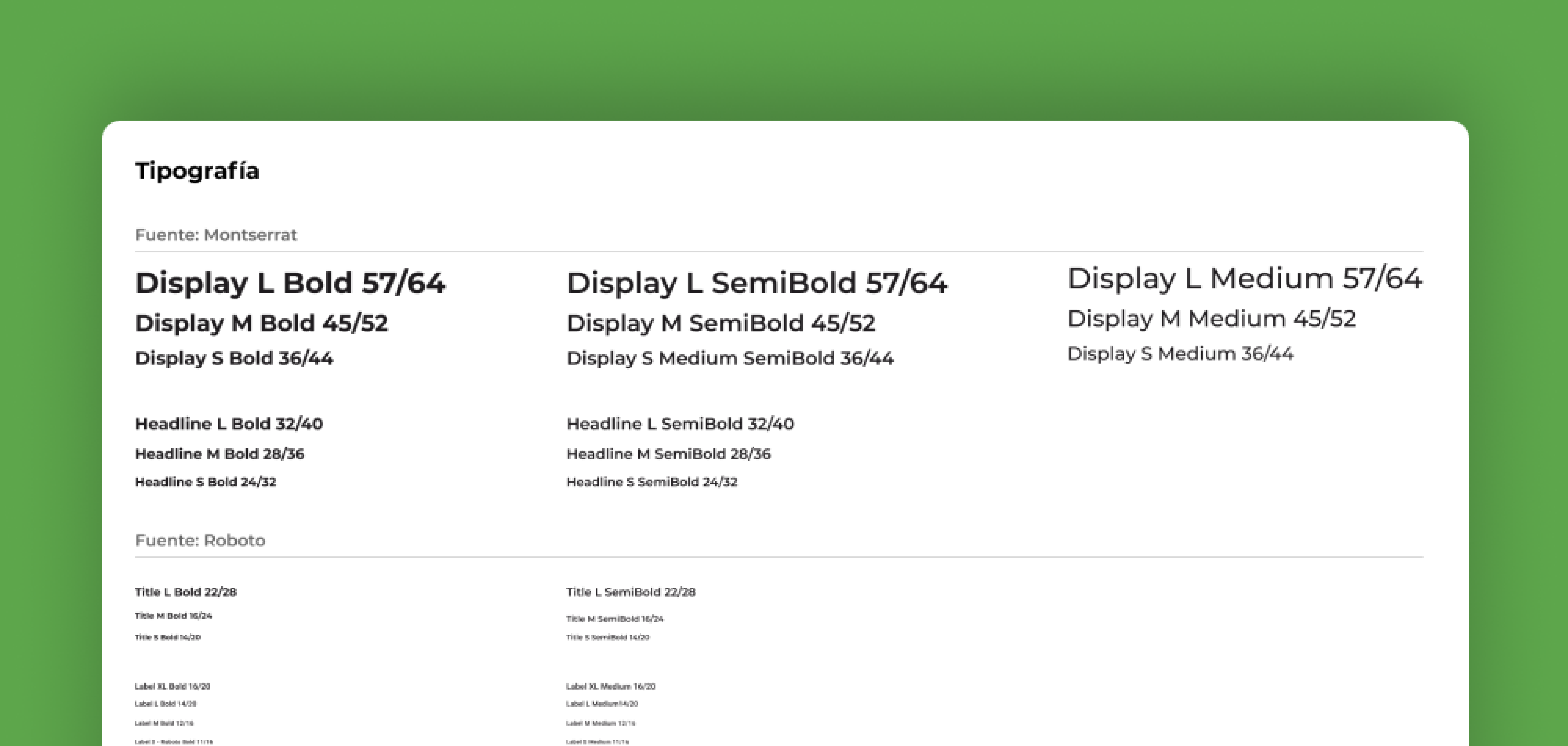
After many iterations, we agreed with the UX designer to use two fonts: Montserrat for display and headers, and Roboto for paragraphs and labels. This combination of sans-serif fonts enhanced readability, variety, and minimalism in the design:
After many iterations, we agreed with the UX designer to use two fonts: Montserrat for display and headers, and Roboto for paragraphs and labels. This combination of sans-serif fonts enhanced readability, variety, and minimalism in the design:


By establishing the color palette, fonts, grids, and icons, the visual identity began to take shape. I then created additional components such as buttons, dropdowns, badges, inputs, headers, footers, tabs, notifications, selectors, and more. These components were then integrated into the screens:
By establishing the color palette, fonts, grids, and icons, the visual identity began to take shape. I then created additional components such as buttons, dropdowns, badges, inputs, headers, footers, tabs, notifications, selectors, and more. These components were then integrated into the screens:


Each style and component was labeled and organized, making it easy to click, drag, and modify all the screens instantly.
Each style and component was labeled and organized, making it easy to click, drag, and modify all the screens instantly.
Final UI Kit
Final UI Kit
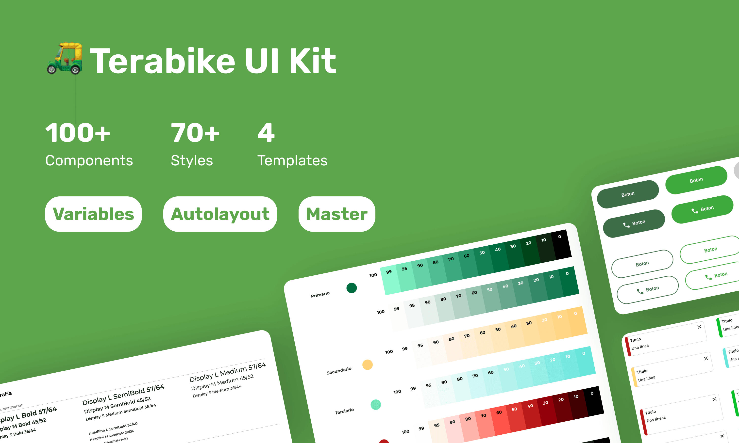
After several weeks of iterating and reviewing new versions of the prototype, I completed the UI Kit. I organized a meeting with the entire team to present this new asset and explained how they could use these styles for their advertising and upcoming website. Following the meeting, I sent an email to the team with links to the Figma files.
After several weeks of iterating and reviewing new versions of the prototype, I completed the UI Kit. I organized a meeting with the entire team to present this new asset and explained how they could use these styles for their advertising and upcoming website. Following the meeting, I sent an email to the team with links to the Figma files.


Because of a non-disclosure agreement, I can't show all the final UI screens I created on Figma. However, you can download the first version of the app here (only for Android users).
Because of a non-disclosure agreement, I can't show all the final UI screens I created on Figma. However, you can download the first version of the app here (only for Android users).
Results
Results
80% increase in efficiency
(measuring the time the UX designer took in sketching a high fidelity prototype)
80% increase in efficiency
(measuring the time the UX designer took in sketching a high fidelity prototype)
Unique identity
(Until now, the Terabike team uses this UI Kit to design their social media posts, website, branding, and the upcoming iterations of the app.)
Unique identity
(Until now, the Terabike team uses this UI Kit to design their social media posts, website, branding, and the upcoming iterations of the app.)
Key Learnings
Key Learnings
A product is in its initial phase
The Terabike team was small, funds were limited, but their dreams were big. It was my first time working in an environment where people truly cared more about the product than the profits. This allowed me to take my time iterating on the UI components and learning more about accessibility standards."
The importance of presenting your work
After presenting my work to the team, they realized they were unaware of UI Kits and their usefulness. Seeing my process, they began allocating time in the sprint to update the kit.
The importance of presenting your work
After presenting my work to the team, they realized they were unaware of UI Kits and their usefulness. Seeing my process, they began allocating time in the sprint to update the kit.
© Rosa Moriya 2023
Made with Framer
© Rosa Moriya 2023
Made with Framer
© Rosa Moriya 2023
Made with Framer