poster series
poster series
Minimalist posters for International Students
Minimalist posters for International Students
Visual Design • Illustration
Visual Design • Illustration


Overview
Overview
Role
Role
Visual Designer, Illustrator.
Solo project.
Duration: 3 weeks.
Visual Designer, Illustrator.
Solo project.
Duration: 3 weeks.
About
About
The International Healthy Not Healthy Student, or @IHNHstudent, is a social media channel designed to share tips and humorous content for international college students. It addresses the challenges of managing coursework while dealing with issues related to living alone, mental health, and eating habits.
The International Healthy Not Healthy Student, or @IHNHstudent, is a social media channel designed to share tips and humorous content for international college students. It addresses the challenges of managing coursework while dealing with issues related to living alone, mental health, and eating habits.
Project Goal
Project Goal
Create a series of posters that present the challenges international students have to face on a daily basis to grow the client’s IG account.
Create a series of posters that present the challenges international students have to face on a daily basis to grow the client’s IG account.
Target Audience
Target Audience
International college students, primarily aged 17-24, in their first year of studies, face challenges such as grocery shopping, cooking for themselves, studying hard, adapting to a new environment, dealing with loneliness and homesickness, and managing finances. They often seek memes and entertainment to unwind and laugh after a busy day.
International college students, primarily aged 17-24, in their first year of studies, face challenges such as grocery shopping, cooking for themselves, studying hard, adapting to a new environment, dealing with loneliness and homesickness, and managing finances. They often seek memes and entertainment to unwind and laugh after a busy day.
Design Strategy
Design Strategy
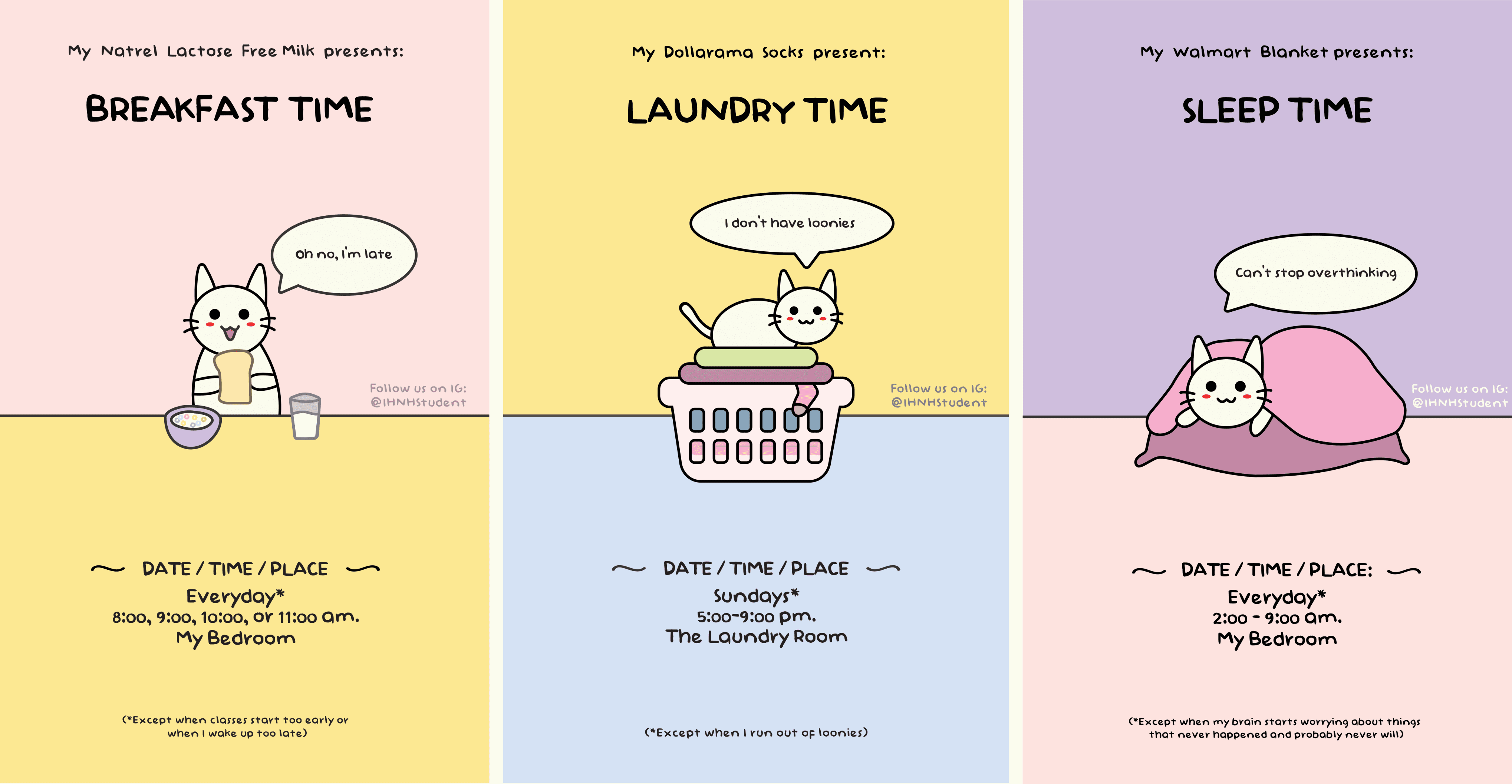
The design strategy for the posters focuses on cute, minimal, ironic, humorous visuals, as well as relatable text. Using pastel colors and simple graphics, the aim is to instantly connect, entertain, and bring a smile to international students.
The design strategy for the posters focuses on cute, minimal, ironic, humorous visuals, as well as relatable text. Using pastel colors and simple graphics, the aim is to instantly connect, entertain, and bring a smile to international students.
Process
Process
I started this project by gathering visual and multimedia references, with the main inspiration being the 'Kawaii' style, a popular trend on social media. 'Kawaii' means 'cute' in Japanese and features cartoonish characters, pastel colors, and rounded shapes. With this in mind, I created the following moodboard:
I started this project by gathering visual and multimedia references, with the main inspiration being the 'Kawaii' style, a popular trend on social media. 'Kawaii' means 'cute' in Japanese and features cartoonish characters, pastel colors, and rounded shapes. With this in mind, I created the following moodboard:
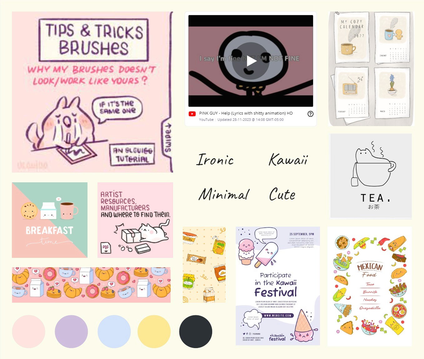


My references used a handwritten typeface to create a crafty mood and employed text inside rectangles to establish hierarchy between elements. I also liked how many included different characters with facial expressions, as faces naturally attract attention. With these insights, I began making some sketches:
My references used a handwritten typeface to create a crafty mood and employed text inside rectangles to establish hierarchy between elements. I also liked how many included different characters with facial expressions, as faces naturally attract attention. With these insights, I began making some sketches:
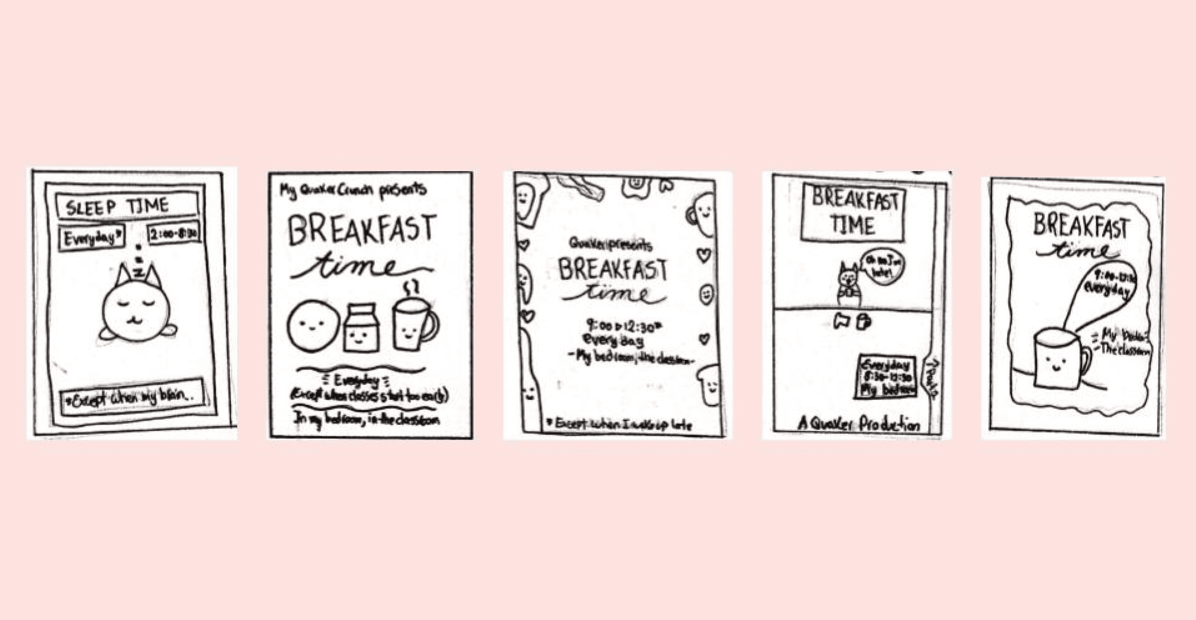


Among these ideas, I considered the one featuring a cat to be the best for social media, given their enduring popularity. I also liked that this concept allowed me to use speech balloons to better align with the text content.
Among these ideas, I considered the one featuring a cat to be the best for social media, given their enduring popularity. I also liked that this concept allowed me to use speech balloons to better align with the text content.
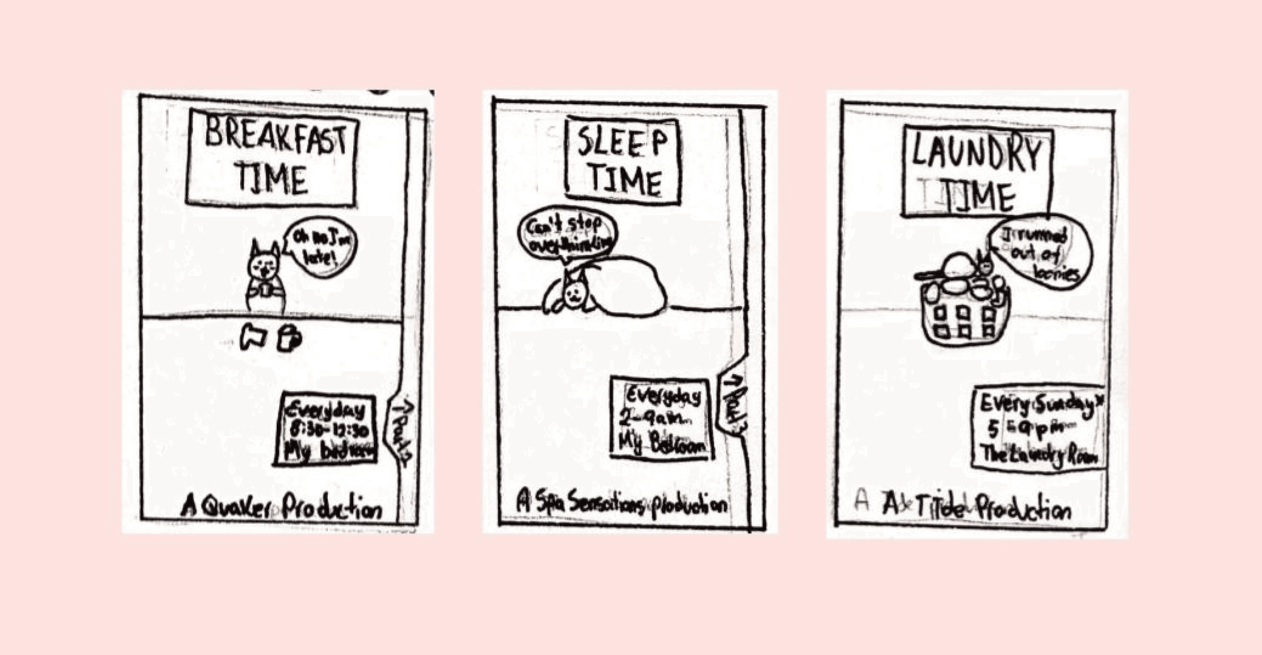


With a clear concept in mind, I created digital renditions in Illustrator based on my sketches and color palette. Since the cat illustration was the focal point of the poster series, I used the pen tool and my mouse to carefully draw each one. I also adjusted the kerning and hierarchy using the Baby Doll font, chosen for its match with the handwritten typefaces found in kawaii comic inspirations.
With a clear concept in mind, I created digital renditions in Illustrator based on my sketches and color palette. Since the cat illustration was the focal point of the poster series, I used the pen tool and my mouse to carefully draw each one. I also adjusted the kerning and hierarchy using the Baby Doll font, chosen for its match with the handwritten typefaces found in kawaii comic inspirations.
Final Design
Final Design
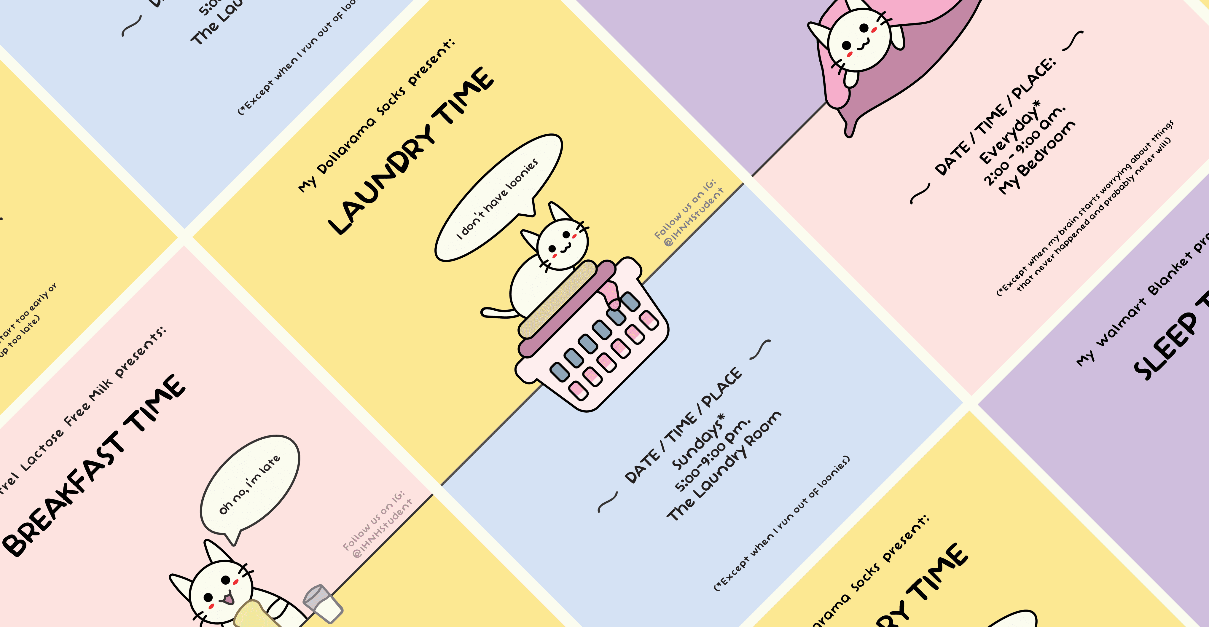
Finally, I presented the completed posters to my target audience, who responded with smiles and laughter at the hilarious, minimalistic, and cute poster series.
Finally, I presented the completed posters to my target audience, who responded with smiles and laughter at the hilarious, minimalistic, and cute poster series.


© Rosa Moriya 2023
Made with Framer
© Rosa Moriya 2023
Made with Framer
© Rosa Moriya 2023
Made with Framer